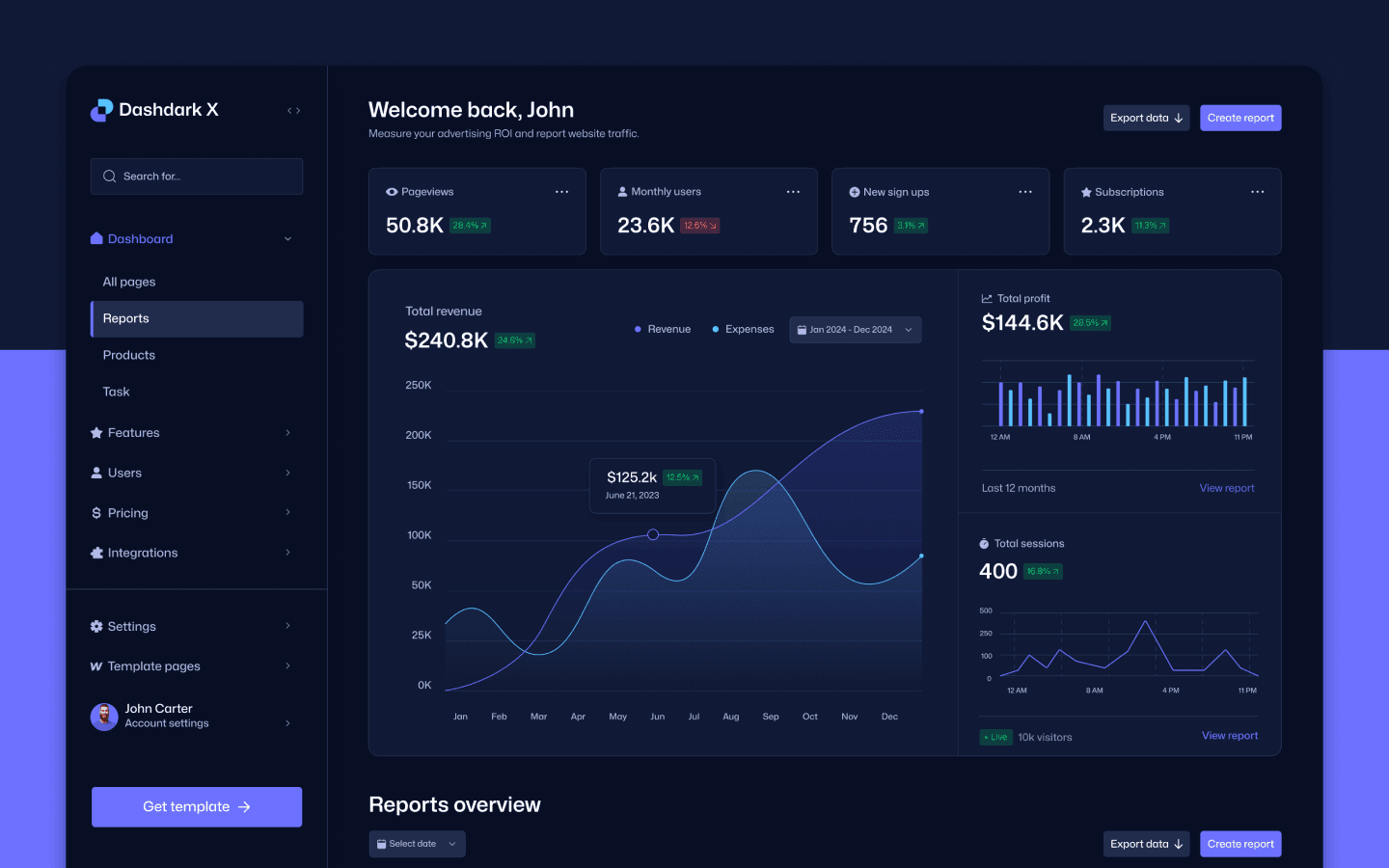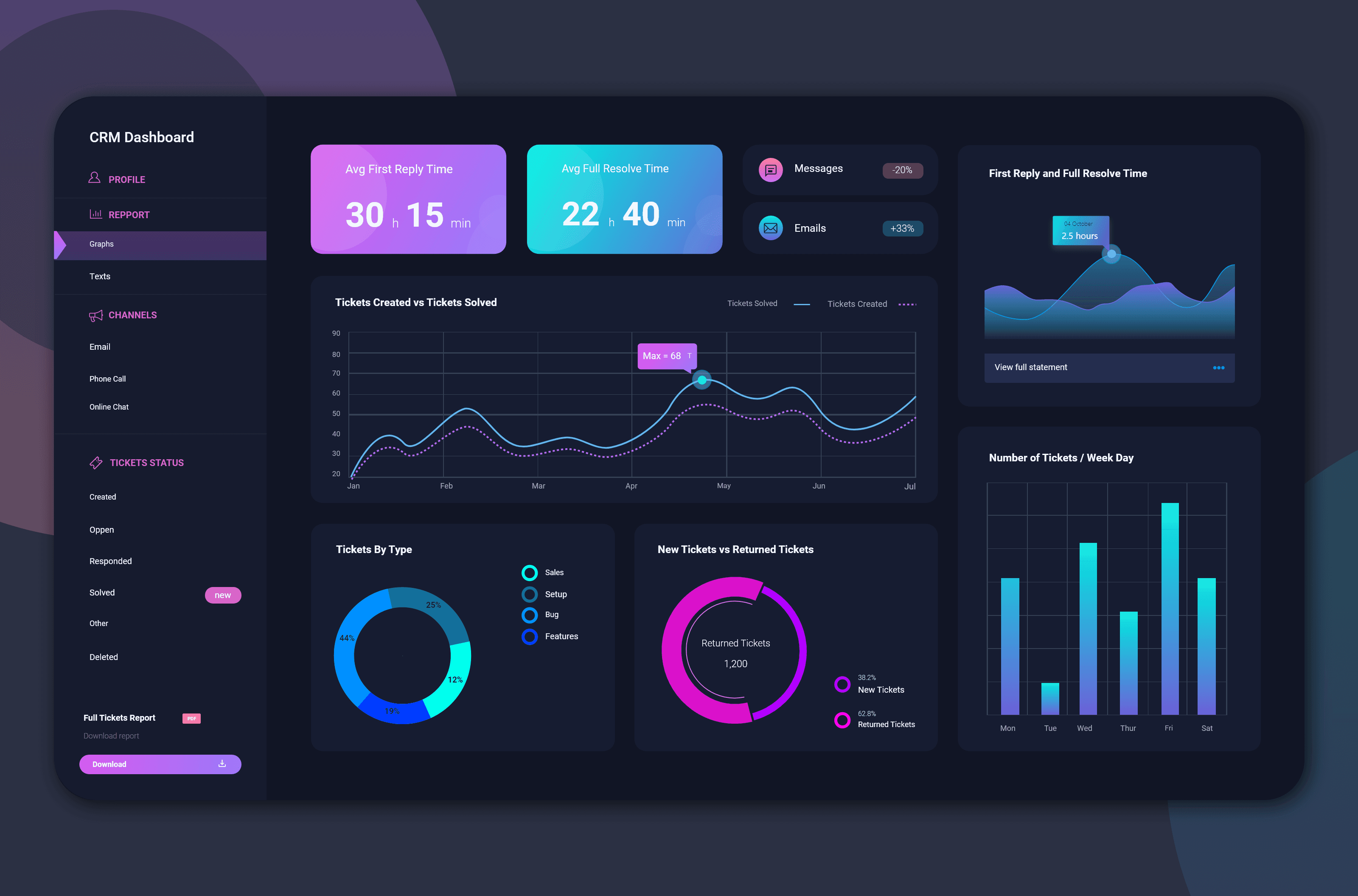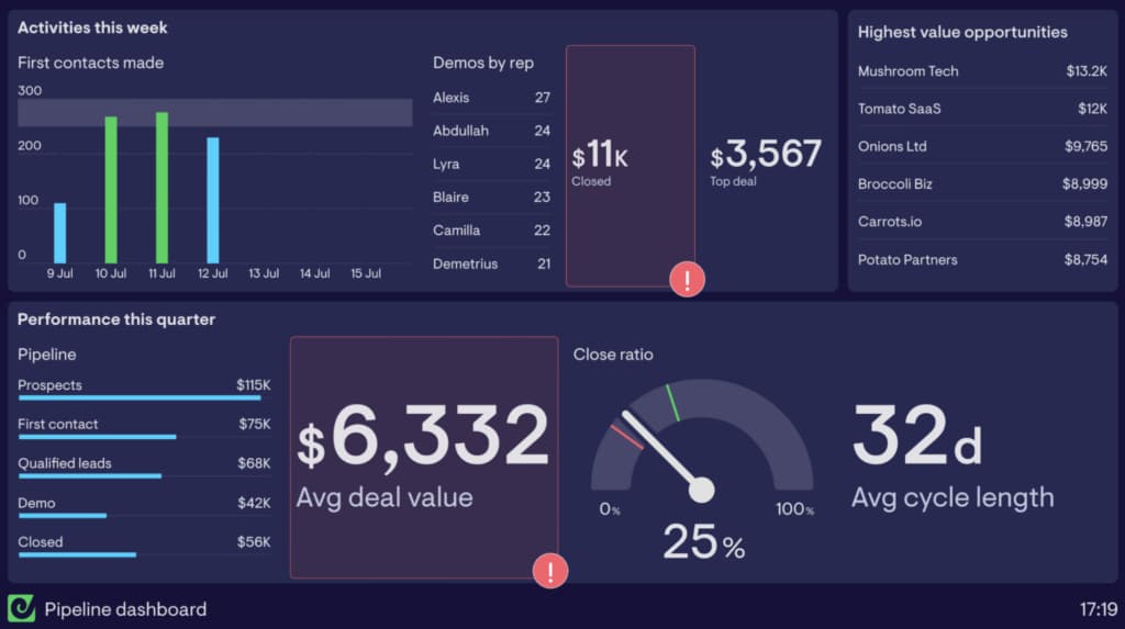
Most dashboards fail for the same reason: they're organized around the data that's available rather than the decisions someone actually needs to make.
Start with the question, not the table
Before designing a single chart, we asked customers what question they were trying to answer when they opened the dashboard. That question, not the underlying schema, became the organizing principle for the page.
Fewer numbers, more context
A metric without context is just a number. We paired every key figure with a comparison — last week, last month, target — so a glance at the dashboard tells you whether things are going well, not just what the value is.
Make the default view the useful view
Customization is valuable, but most people never touch it. We spent most of our effort making the default view genuinely useful, so a new customer gets value before they've configured anything.